Circular Action Alliance
Designing an AI-Assisted Packaging Intelligence Platform
Role
UX Designer
Timeline
Feb 2026 - April 2026 (3 Months)
Team
1 Project Manager
5 Software Developers
1 UX Designer
Type
Product Design • B2B
Background
Circular Action Alliance helps producers comply with Extended Producer Responsibility regulations by collecting packaging data from thousands of companies. Producers self-report the packaging used across their product portfolios, but validating these submissions manually is slow, inconsistent, and difficult to scale.
CAA began developing an AI-assisted system capable of extracting packaging information from publicly available sources. Technology could estimate packaging types, materials, and weights, but analysts still needed an efficient way to verify those results.
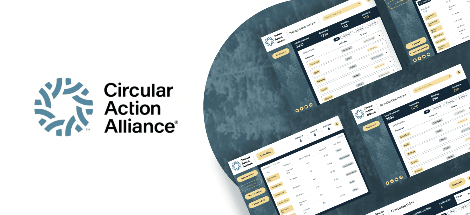
This project focused on designing a desktop platform that transforms packaging datasets into an intuitive validation workflow. The platform helps analysts understand, compare, and confidently evaluate whether extracted data aligns with producer submissions.
Design Goals
Reduce the time required to review producer packaging data
Simplify comparisons between reported and AI-extracted information
Increase trust through transparent, source-backed data
Create a scalable workflow capable of supporting thousands of producers
Research + Design Thinking
This project did not include formal user interviews, so I conducted workflow analysis. As I analyzed each analyst task, I came up with 2 design insights.
Analysts review hundreds, sometimes thousands, of producers.
I considered displaying as much producer information as possible on the dashboard, however, I realized the dashboard wasn't where decisions happened. Its purpose was just for the navigation. Adding more information actually slowed users down.
Analysts need context before making comparisons.
One early idea was jumping directly from the Dashboard into the comparison table. Although this saved a click, it created another problem. Analysts had no understanding of the producer before reviewing discrepancies.
Wireframing & Early Exploration
To understand how analysts would naturally think, I focused on the sequence of decisions users needed to make and the workflow quickly became clear:

With this, I translated each stage into low-fidelity wireframes. With basic hand-drawn wireframes, my goal was to determine what information analysts needed at each step and how they could move efficiently between tasks. These designs explored the layout of three core screens:
Dashboard: Search and filter producers while tracking review status.
Producer Profile: Provide a centralized view of products, packaging types, Bills of Materials, and supporting data.
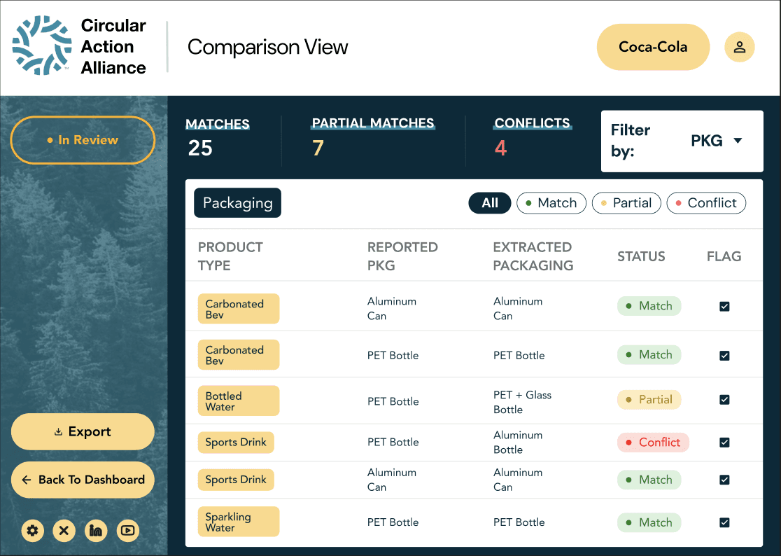
Comparison View: Present AI-extracted and producer-reported data side by side to simplify validation.


Design System
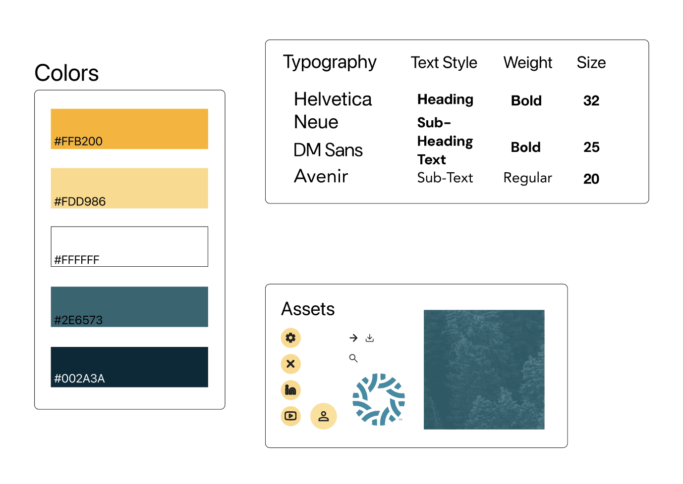
Instead of creating an entirely new visual identity, I chose to build upon Circular Action Alliance's existing design system. Because this platform is intended for internal analysts, maintaining visual consistency with CAA's creates a more seamless experience across products. I wanted users to immediately recognize the platform as part of the same ecosystem. Reusing established colors, typography, and iconography reduces the learning curve and reinforces confidence in the product.
I used the primary brand colors, typography, and visual assets from the existing Circular Action Alliance website to establish a lightweight design system before beginning wireframes.


Dashboard
Designing for Fast Discovery
My first dashboard looked much more like a spreadsheet. It exposed dozens of data fields because I assumed analysts would want as much information as possible. Upon reviewing the workflow, I realized the dashboard should not be where analysts analyze data. It should simply help them get to the right producer as quickly as possible. Removing unnecessary metadata, I prioritized:
Search
Filters
Review
Status
Producer
Name
Industry
This shifted the Dashboard from an
information repository into a navigation
tool.

Producer Profile
Organizing Complexity
I experimented with separating packaging information into multiple pages. Products -> Packaging -> BOMs -> Weight Data. This was organized, but required constant page switching. So, I consolidated related information into one vertically structured page, cutting out unneeded info. The final page includes:
Company Information
Product Types
Packaging Types
Material Composition
Weight Ranges
CMC Map
This allows analysts to stay in context without
requiring extensive effort on their ends.

Comparison View
Reducing Mental Work
The row-by-row comparison tables allow for easy analysis and different packaging types are easily switched through expandable sections. Every reported value now sits directly beside its extracted counterpart. Color-coded validation states make discrepancies immediately visible. Expandable rows reveal:
Bill of Materials
Weight Comparison
CMC Category
Packaging
Instead of forcing analysts to compare
two datasets mentally, the interface performs
that work visually.
Iteration
From Comprehensive to Clear


The Initial Direction
My instinct was to surface as much information as possible.
Because analysts work with highly detailed packaging data, I assumed
providing every available attribute upfront would make the interface
more useful.
Although technically complete, the interface quickly became visually
overwhelming.
What I Realized
Users weren't trying to read every piece of information, they were trying to answer one question at a time.
By presenting everything simultaneously, I was forcing analysts to spend unnecessary effort deciding what to pay attention to. The problem wasn't the amount of information. It was the hierarchy.
To improve clarity, I made several key revisions:
Reduced the amount of visible information on each page
Grouped related data into clear sections
Introduced expandable rows for technical details
Increased whitespace to separate information visually
Improved alignment and spacing within comparison tables
Simplified row layouts so each comparison could be understood at a glance
Instead of scanning dozens of competing data points, analysts can quickly identify discrepancies and expand only the information relevant to their review. The interface became easier to scan, easier to learn, and ultimately better aligned with how analysts naturally make decisions.
Key Design Decisions


Final Solution
Reflection
This project changed how I think about UX design. Initially, most of my experience involved consumer-facing products where success meant making designs simpler and more visually engaging. This project introduced a different challenge: designing for enterprise users who rely on complex information to make decisions.
I learned that good enterprise UX isn't about removing complexity, but rather organizing it. Every design decision, from separating the workflow into three distinct stages to using progressive disclosure and confidence indicators, was driven by the question, "What information does the analyst need right now?" That mindset helped me move beyond designing screens and toward designing decision-making processes.