Redesigning Visual
Storytelling with Music
An editorial design project that transformed themes from Kendrick Lamar's music into a cohesive
visual narrative using typography, illustration, and sequential storytelling.
Role
Visual Designer
Timeline
Sep 2024 - May 2025 (8 Months)
Type
Visual Design • Editorial

12
Original
Artworks
870k+
Online
Views
100+
Visitors at art
exhibition
5
AP Art
Score
Background
Music often communicates ideas that are difficult to explain through words alone. Albums like To Pimp a Butterfly explore race, identity, power, self-worth, and systemic injustice through layered metaphors, recurring motifs, and nonlinear storytelling. While these themes make the album powerful, they can also make it difficult for new listeners to fully understand its narrative.
I wanted to explore whether visual design could bridge that gap.
Rather than simply illustrating lyrics, I challenged myself to translate one song into one original artwork, creating a cohesive series that preserved emotional nuance while making abstract ideas more approachable. Over the course of eight months, I created twelve pieces that combined realism, symbolism, typography, and mixed media into a unified visual language.
Understanding the Viewer
Although the project centered around Kendrick Lamar's music, I wasn't designing exclusively for existing fans. Instead, I designed for viewers like Emma: someone who appreciates music but may not understand the deeper cultural and emotional narratives embedded within the album.
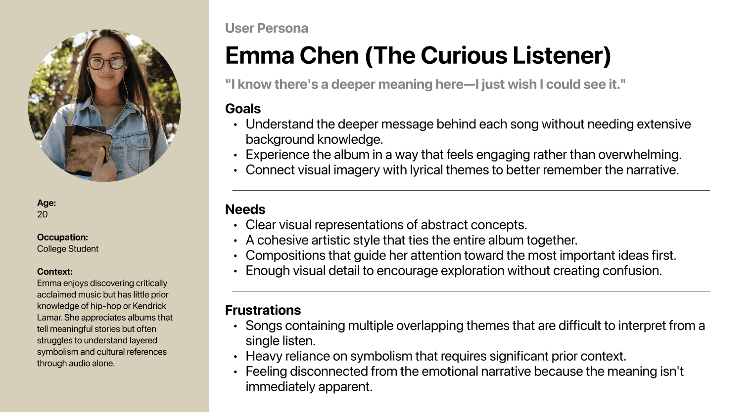
Rather than expecting viewers to decode symbolism on their own, each composition needed to communicate meaning through visual hierarchy, composition, facial expression, and storytelling while still leaving room for interpretation.
Research
Before beginning each illustration, I spent significant time understanding the story behind every song. Research included:
Lyric analysis
Interviews with Kendrick Lamar
Podcasts and album breakdowns
Historical research on racial injustice and identity
Graphic design and poster composition studies
Instead of asking "What should this drawing look like?" I asked "What should someone understand after seeing this?" This shifted the project from illustration toward visual communication.
Key Findings
Patterns that emerged



Early Exploration
Rather than committing to the first idea, I explored multiple visual approaches before selecting the strongest concept. Many early sketches were intentionally simple, allowing me to iterate rapidly before investing hours into rendering. Each artwork began with quick thumbnail sketches exploring:
Composition
Focal points
Visual angle
Hierarchy
Medium
Combinations



Design Decision 01
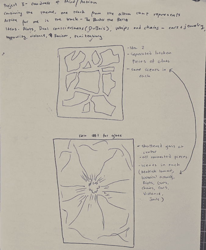
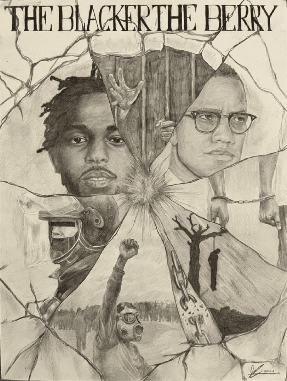
Representing Multiple Themes in "The Blacker the Berry"
The song explores identity, racism, anger, resilience, and contradiction simultaneously. Initially I explored a single portrait, which while visually strong, reduced the song to one emotion. I then explored a narrative scene which was easier to understand, but became overly literal and removed much of the song's complexity. Thus, I designed a fractured composition inspired by shattered glass to display multiple scenes. Each fragment represented a different aspect of the song while the central portrait anchored the viewer's attention. This allowed complexity without sacrificing hierarchy.
Trade-Off: Clarity vs Complexity
Adding more visual fragments increased narrative richness but also increased cognitive load. To balance both:
the largest crack became the primary focal point
secondary scenes decreased in visual weight
contrast guided the eye through the composition
The result was controlled complexity
rather than visual chaos.
Design Decision 02
Visualizing Internal Conflict in "i"
Unlike other songs, "i" focuses almost entirely on psychological conflict and there is no obvious scene to illustrate. My earliest concepts relied on literal representations of emotion which was understandable, but lacked subtlety. Instead, I shifted toward emotional atmosphere. A burst of black ink radiating behind the subject became a metaphor for internal pressure while posture, expression, and surrounding symbolic objects communicated vulnerability without relying solely on explicit imagery.
Trade-Off: Directness vs Interpretation
More explicit imagery improves immediate understanding and More subtle imagery invites longer reflection. Rather than choosing one approach completely, I balanced both.
The emotional state remains immediately recognizable, while symbolic
elements reward viewers who spend more time examining the composition.

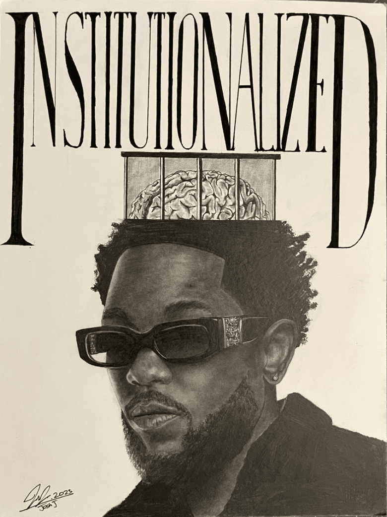
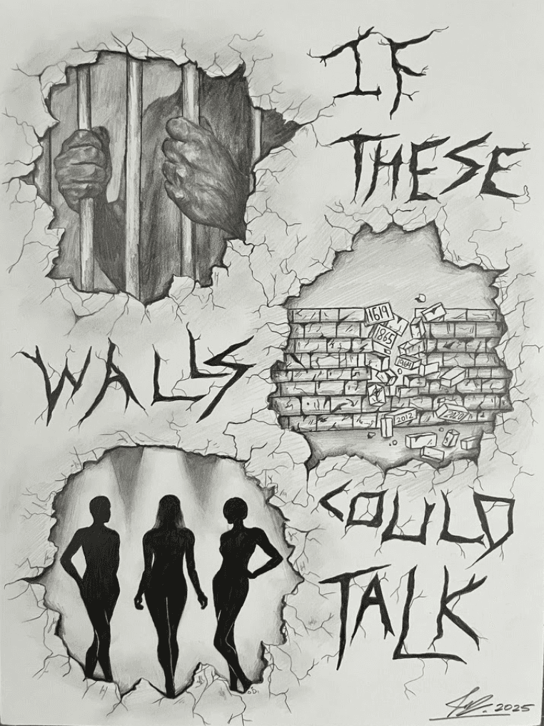
Final Collection
The final portfolio consists of twelve original artworks translating the songs from To Pimp a Butterfly into visual narratives.
Each illustration balances realism, symbolism, typography, and composition to communicate themes that would otherwise remain abstract through music alone.




Reflection
Although this project wasn't a traditional website or mobile app, it reinforced that UX extends beyond digital interfaces. Every design decision, from page layouts and information hierarchy to typography, composition, and visual pacing, was made with the viewer's experience in mind. I approached each spread the same way I would approach a product: understanding the user's goals, reducing cognitive load, and guiding attention through intentional visual hierarchy.
This project also strengthened my ability to communicate complex ideas through design rather than words alone. I learned that effective storytelling depends not only on compelling visuals, but on creating a clear and intuitive experience that helps viewers build meaning as they move through the work.
Most importantly, the project reminded me that the principles of user-centered design are universal. Whether designing a digital interface or a visual narrative, the goal remains the same: create experiences that are thoughtful, intentional, and easy for people to understand. That mindset continues to shape how I approach every design challenge today.
listen here!