VOID Tech (Atmos)
Designing a weather application for travelers and long-term planners.
Role
UI/UX Designer
Timeline
Nov 2025 (2 weeks)
Type
Product Design • B2C
Tools
Figma

Background
The Why
Weather applications often prioritize displaying large amounts of weather data but rarely adapt to the different goals of their users. A frequent traveler wants quick access to current conditions across multiple cities, while someone planning weeks in advance needs historical trends and long-term forecasts. Combining these experiences into a single interface without overwhelming users became the central design challenge.
Design Goals
Make current weather easy to scan across multiple cities.
Support both short-term travel and long-term planning.
Create a polished interface that feels calm and intuitive.
Research & Key Insights
Two Distinct Users: Rather than designing for a generic weather app user, I focused on two distinct personas.
Frequent Travelers
Travelers often check weather multiple times throughout the day while moving between locations.
Their priorities include:
Current temperature
Local time
Short-term forecasts
Fast scanning
Long-Term Planners
Long-Term planners ask "What will conditions look like over the next several months?"
Their priorities include:
Weather trends
Seasonal comparisons
Rainfall patterns
Long-term temperature changes
Early Exploration
I began with low-fidelity wireframes to test navigation, layout hierarchy, and information density before introducing branding and color.

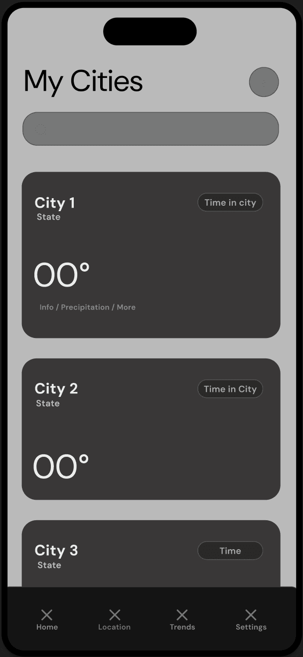


The wireframes focused on answering three questions:
What information should users see immediately?
What information can be secondary?
How can multiple user types share one navigation system?
Design System
Weather applications are used frequently throughout the day, often for only a few seconds at a time. I wanted the interface to feel calm, familiar, and effortless to scan. The visual language emphasizes:
High contrast for readability
Rounded cards for grouping related information
Consistent spacing
Minimal color usage outside of weather states
Large typography for temperature

Home Dashboard
Prioritizing Current Conditions
The home screen answers the user's first question: "What do I need to know right now?" Instead of immediately presenting detailed forecasts, the interface prioritizes:
Current temperature
Weather condition
Today's highs and lows
Wind Humidity
UV Index
Hourly forecast
Five-day forecast
This creates a clear information hierarchy where
essential information is immediately visible while
supporting details remain nearby.

Multiple Locations
Supporting Frequent Travelers
Managing several cities is one of the biggest pain points for travelers. Rather than requiring users to search every time, I designed a dedicated locations page that surfaces saved cities as large weather cards. Each card includes:
Current weather
Time zone
Temperature
Conditions
This allows users to compare multiple locations
with a quick scroll instead of repeatedly opening
individual city pages.

Long-Term Trends
Designing for Planning
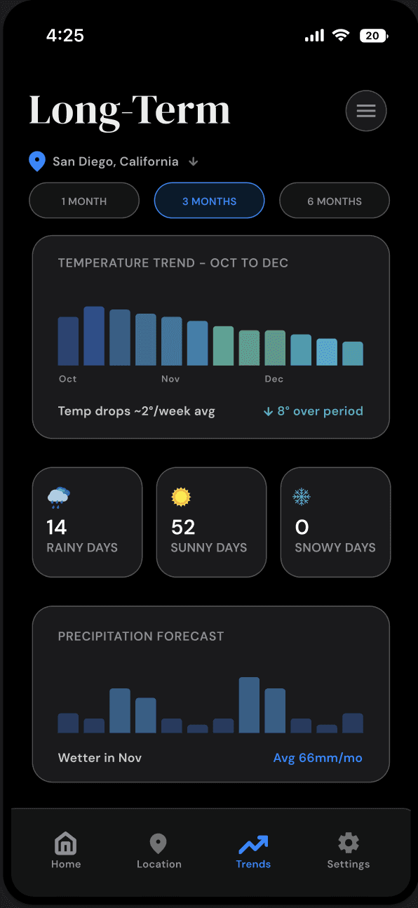
Most weather applications stop at a seven-day forecast. To better support long-term planners, I introduced a Trends page that visualizes weather across one, three, and six month periods. Instead of displaying daily forecasts, the interface highlights:
Temperature trends
Rainfall patterns
Seasonal summaries
Monthly weather insights
This shifts the experience from daily checking
toward planning and decision making.
Settings
Personalizing the Experience
Because weather information varies by user preference, I created a centralized settings page allowing users to customize:
Temperature units
Wind speed units
Appearance
Notification preferences
Accent colors
Keeping these controls in one location reduces clutter
throughout the rest of the application while allowing the
experience to adapt to individual needs.

Final Product
The final design delivers a weather application that adapts to two fundamentally different user groups without sacrificing simplicity.
Travelers can quickly check multiple locations and short-term forecasts, while long-term planners gain access to meaningful weather trends through dedicated visualizations.
The result is an interface that balances depth with clarity, making complex weather information easier to explore, understand, and act upon.
Reflection
This project reinforced that effective UX design is not about presenting more information, but rather presenting the right information at the right moment.
Designing for two distinct user groups challenged me to think beyond individual screens and instead consider how information architecture could support different goals within a single product. It also strengthened my ability to establish visual hierarchy, prioritize content, and create interfaces that remain intuitive despite supporting multiple workflows.
If I continued this project, I would expand personalization further by allowing users to customize their dashboard, reorder weather modules, and receive context-aware recommendations based on travel plans and seasonal patterns.